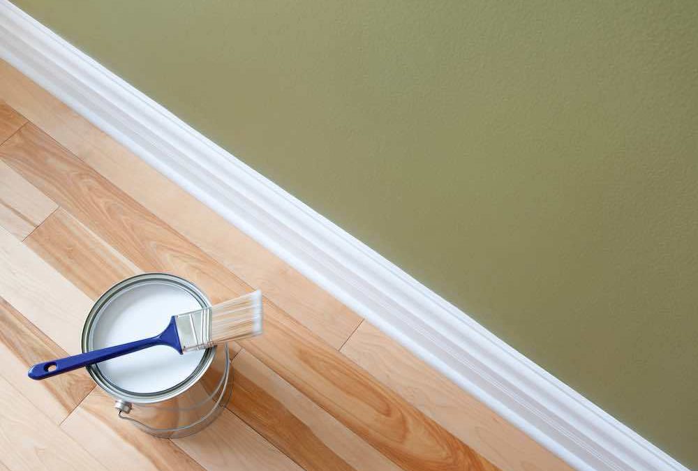
Should ceiling color match trim and molding?
Should ceiling color match trim and molding?
When building home ceilings and moldings are always a priority. Well, painting your room is a magical moment where you get to enjoy the chance to customize and improve the curb appeal of your home’s appearance.
Of course, it is normal to think about what’s best for your room in terms of painting and decoration. Or whether matching the colors of your ceiling and molding would be advantageous for your situation.
Well, there is no hard and fast rule when it comes to painting your ceiling and moldings. This choice is truly a matter of personal preference. However, most homeowners agree that having a matching trim and ceiling can add a unified, neat look to any home.
If you opt to have a variation in color, it can help to turn your trim into a statement item. Remember, this is one of the first few things that your guests will see. And although you may not often have guests, it is always great to create an impression. To make your painting session easier, we have outlined the basics of painting your trim and ceiling.
Why Do You Have To match Your Ceiling Color with The Trim and Molding?
It creates the illusion of a larger room
It is true that a uniform ceiling and trim can make your home look neat. Moreover, it can add contrast to your walls and make your space look bigger. It creates an attractive visual effect, which is why most major interior designers would advise this.
It harmonizes the Space
It gives your room a unified feel and harmonizes the colors of your interior. Did you ever see a room that just felt like it was perfectly designed to match up everything? That’s usually what you usually get with applying professional painting techniques to your space.
It emphasizes your wall color
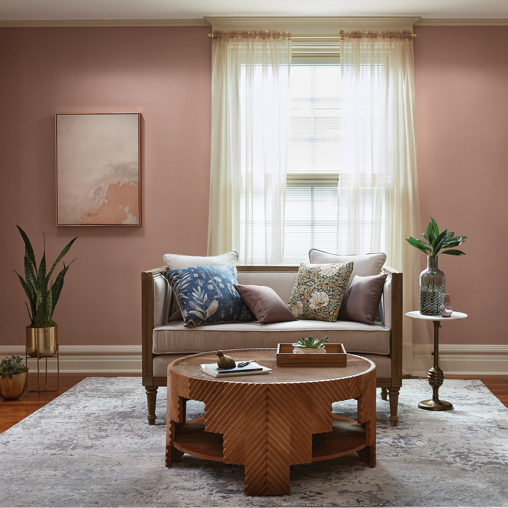
Matching your trim with your ceiling and having a different color for your wall is ideal for any home. This technique helps emphasize the color of your wall and brings out the rest of the elements in your home. If you have a modern wallpaper design, you can bring attention to it by having a classic color trim and matching it with the color of your ceiling.
Generally, it is important that you match things up in your home. The proper combination of the various elements in your home can make your interior stand out.
The Benefits of Trim and Molding Application
The trim and molding of your home can add a characteristic to your home. The casings can also add a personality to your interior feelings, depending on the design and color. Add trim and moldings to your home to raise the curb appeal and distinction to your home interior.
Starting at the Floor
So now that you have decided to match your ceiling and your trim, let’s talk about how your baseboards are going to be. Baseboards are moldings that are placed at the bottom of your wall. They set the aesthetical foundation to every room in your home and create a boundary between the drywall and the floor.
When matching you’re ceiling and your trim, you might as well match the color of your baseboards. Baseboards should be throughout the home to ensure a transition from room to room. Tie decorative baseboards to match the architectural design to create your desired ambiance for your home.
Door Jams and Casings
Door casings can help define the entrance to your room and protect the area around the door.
However, it also helps in improving the appeal of your home. Most homes would match their ceiling, trims, and door casings. Then create a contrast by painting the walls with a different color. For example, you can have a white ceiling, trim, and door casings, and beige or ivory for your walls.
This will bring a classic appeal and unique warmth to your ambiance. Feel free to play with any color. The key is to have the proper combination of colors that will look good together.
Crown Molding
Installing crown moldings can raise the appeal and elegance of your home. You can run it across the upper wall and the ceiling. Depending on the design, the crown molding will send either a bold or classic vibe. The design and color bring the character of the crown molding.
Match the styles of baseboards and crown trim to complete our room. Door casings don’t really have to match the base sheets or moldings. Keep the door casings easy to stay away from over incitement assuming the base sheets and crown moldings are fancy.
Contrast paint colors of the dividers and moldings to conflicts of colors. Play around with the trim and moldings to customize your living space.
What is the Best Color For Your Trim?
When you are trying to select a color for your trim, you can go by the popular opinions. You have to take a look at your room’s designs and the rest of the colors in your home to create harmony. Check these guidelines to help you.
- Apply light color in high-traffic areas. Lighter colors like white, cream, beige, or ivory can create the illusion of a bigger space. It makes the area light and airy. It also helps conceal dust and grime that have accumulated in the room.
- Rooms that are aiming for a more dramatic appeal must consider getting darker trims and finish. However, if you are matching your trim to your ceiling, this may look your room a little “squashed.” If you want to utilize darker colors, we suggest painting them on your wall. For example, you can utilize dark charcoal or your walls and white for your ceilings and trims.
- Light shades are ideal for hiding moisture buildup. For areas that usually accumulate moisture like the bathroom and the kitchen, you can paint them with lighter colors.
- Try to match the trim’s shade with the surrounding decorations and colors. If you have a bright green carpet, it is okay to go a little with your colors in surrounding areas. Depending on the mood that you want to set for your home, your choice of colors can greatly vary.
Wild Fox Painting
Guest Writer
Wild Fox Painting is focused on providing Trustworthy, Reliable and Respectful interior painting solutions for your home.


Recent Comments