Should ceiling color match trim and molding?

Should ceiling color match trim and molding?

Should ceiling color match trim and molding?

When building home ceilings and moldings are always a priority. Well, painting your room is a magical moment where you get to enjoy the chance to customize and improve the curb appeal of your home’s appearance.

Of course, it is normal to think about what’s best for your room in terms of painting and decoration. Or whether matching the colors of your ceiling and molding would be advantageous for your situation.

Well, there is no hard and fast rule when it comes to painting your ceiling and moldings. This choice is truly a matter of personal preference. However, most homeowners agree that having a matching trim and ceiling can add a unified, neat look to any home.

If you opt to have a variation in color, it can help to turn your trim into a statement item. Remember, this is one of the first few things that your guests will see. And although you may not often have guests, it is always great to create an impression. To make your painting session easier, we have outlined the basics of painting your trim and ceiling.

Why Do You Have To match Your Ceiling Color with The Trim and Molding?

It creates the illusion of a larger room

It is true that a uniform ceiling and trim can make your home look neat. Moreover, it can add contrast to your walls and make your space look bigger. It creates an attractive visual effect, which is why most major interior designers would advise this.

It harmonizes the Space

It gives your room a unified feel and harmonizes the colors of your interior. Did you ever see a room that just felt like it was perfectly designed to match up everything? That’s usually what you usually get with applying professional painting techniques to your space.

It emphasizes your wall color

Matching your trim with your ceiling and having a different color for your wall is ideal for any home. This technique helps emphasize the color of your wall and brings out the rest of the elements in your home. If you have a modern wallpaper design, you can bring attention to it by having a classic color trim and matching it with the color of your ceiling.

Generally, it is important that you match things up in your home. The proper combination of the various elements in your home can make your interior stand out.

The Benefits of Trim and Molding Application

The trim and molding of your home can add a characteristic to your home. The casings can also add a personality to your interior feelings, depending on the design and color. Add trim and moldings to your home to raise the curb appeal and distinction to your home interior.

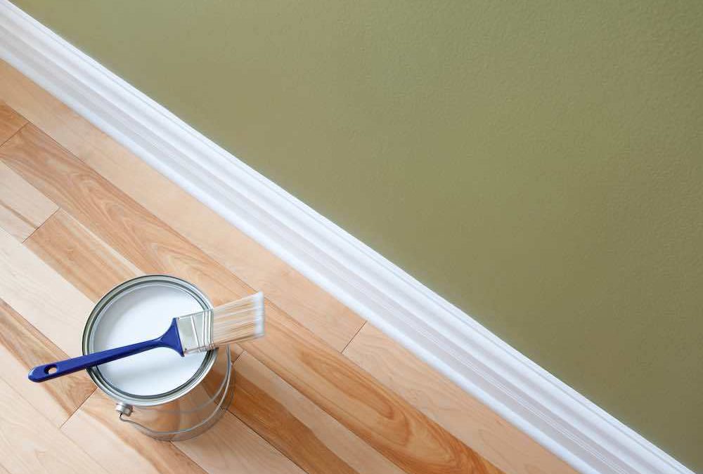
Starting at the Floor

So now that you have decided to match your ceiling and your trim, let’s talk about how your baseboards are going to be. Baseboards are moldings that are placed at the bottom of your wall. They set the aesthetical foundation to every room in your home and create a boundary between the drywall and the floor.

When matching you’re ceiling and your trim, you might as well match the color of your baseboards. Baseboards should be throughout the home to ensure a transition from room to room. Tie decorative baseboards to match the architectural design to create your desired ambiance for your home.

Door Jams and Casings

Door casings can help define the entrance to your room and protect the area around the door.

However, it also helps in improving the appeal of your home. Most homes would match their ceiling, trims, and door casings. Then create a contrast by painting the walls with a different color. For example, you can have a white ceiling, trim, and door casings, and beige or ivory for your walls.

This will bring a classic appeal and unique warmth to your ambiance. Feel free to play with any color. The key is to have the proper combination of colors that will look good together.
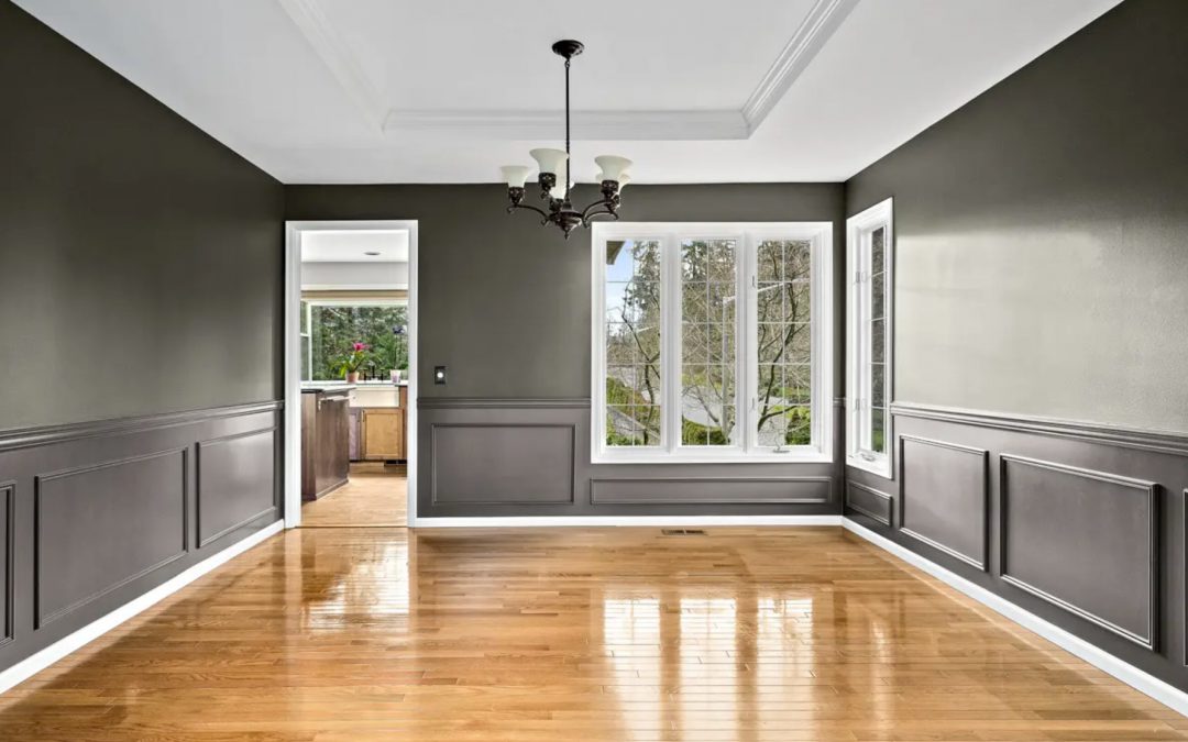
Crown Molding

Installing crown moldings can raise the appeal and elegance of your home. You can run it across the upper wall and the ceiling. Depending on the design, the crown molding will send either a bold or classic vibe. The design and color bring the character of the crown molding.

Match the styles of baseboards and crown trim to complete our room. Door casings don’t really have to match the base sheets or moldings. Keep the door casings easy to stay away from over incitement assuming the base sheets and crown moldings are fancy.

Contrast paint colors of the dividers and moldings to conflicts of colors. Play around with the trim and moldings to customize your living space.

What is the Best Color For Your Trim?

When you are trying to select a color for your trim, you can go by the popular opinions. You have to take a look at your room’s designs and the rest of the colors in your home to create harmony. Check these guidelines to help you.

  • Apply light color in high-traffic areas. Lighter colors like white, cream, beige, or ivory can create the illusion of a bigger space. It makes the area light and airy. It also helps conceal dust and grime that have accumulated in the room.
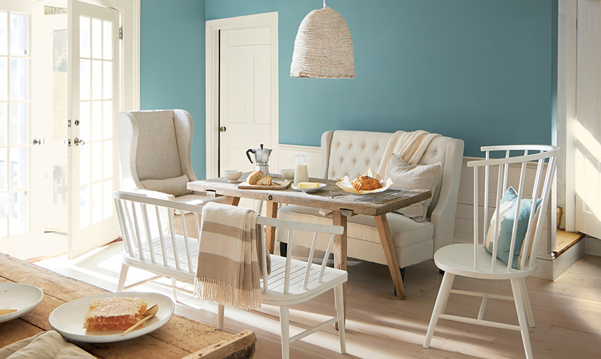
  • Rooms that are aiming for a more dramatic appeal must consider getting darker trims and finish. However, if you are matching your trim to your ceiling, this may look your room a little “squashed.” If you want to utilize darker colors, we suggest painting them on your wall. For example, you can utilize dark charcoal or your walls and white for your ceilings and trims.
  • Light shades are ideal for hiding moisture buildup. For areas that usually accumulate moisture like the bathroom and the kitchen, you can paint them with lighter colors.
  • Try to match the trim’s shade with the surrounding decorations and colors. If you have a bright green carpet, it is okay to go a little with your colors in surrounding areas. Depending on the mood that you want to set for your home, your choice of colors can greatly vary.
Wild Fox Painting

Wild Fox Painting

Guest Writer

Wild Fox Painting is focused on providing Trustworthy, Reliable and Respectful interior painting solutions for your home.

View Pro Profile

Which colors make a room look bigger?

Which colors make a room look bigger?

Which colors make a room look bigger?

Small rooms can be tricky to improve. Besides the limited space, having too many items and furniture can make it even smaller. What you don’t know is that colors can have a huge impact on the size of your room.

If you have a small room, you can make it look even bigger by the choice of colors. Dark colors usually make rooms smaller. But lighter colors such as the shades of nudes or white can make rooms look fresh, cozy, and breathable.

Stark White

Naturally, white is an obvious choice for making a small room feel lighter, bigger, and cozier. It makes the interior a classic and timeless piece. Eggshell or satin finishes are the most popular when it comes to the white shade.

The simplicity of white makes it easier for you to decorate your room because it matches almost all other color combinations. With white walls and ceilings, you can choose from dark, bold, to colorful furniture.

What’s more, it works regardless of your choice for aesthetics. Whether you want a modern kitchen, a minimalist room, or a country-inspired living room, white makes a great palette for any part of your home.

Light Taupe

If you are not willing to go entirely white, you can go with light taupe. This neutral color makes a small room look bright and airy. It is still bright enough to allow light to reflect in every wall but it also adds a touch of warmth.

The expensive tone is commonly used in hotel rooms with small spaces. Just add a little architectural detail to give your room stature. It helps to add nude furnishings to keep the air feels in the room.

Blush Pink

Blush pink is another timeless color you can use to brighten up a small room. It gives the room a feminine touch that looks even more wonderful at sunset hour. This hue can work best with white embellishments and decorations. You can also hang a Scandinavian or geometric wall frame on the biggest side of the wall.

Other tones that will match your blush pink wall are beige, sand, and ivory. If your walls are painted with blush pink, you can have a different tone for your ceiling to add a curb appeal. White or cream paint can definitely look best above and for the moldings as well.

Dark Navy

If you want a strong and bold ambiance without playing with the neutral tones, the safest option is dark navy. The deep navy hue can still make a small room feel big and cozy depending on how you use it. The key is to find the proper blend of wall paint and room décor.

Paint your walls with dark navy to give your room a dramatic and stately feel. However, you can use white tiles for your floors and white paint for your ceiling and moldings. A combination of the gray and white frames can give contrast to your walls. For your bed and furniture, you can opt for creamy and white covers. Or you can even experiment on floral blue tones and hues.

Cool Gray

Who says gray is a dull color? A great alternative to white paint color is a light cool gray. As you paint your walls white, you can have your doors and furniture in gray. A cool gray and white combination can definitely look fresh and breezy when used it.

It creates a visually appealing and cozy room. This is a perfect combination if you want to moderate the use of nude tones, which are apparently more feminine.

Nobody has gone wrong with this combination. As a matter of fact, it is an ideal choice especially if you want to create a minimalist ambiance but still want to maintain an expansive feel.

Earthly Ochre

Earthly ochre is a deep and warm color that creates a perfectly warm environment. It’s an ideal option if you don’t want too much brightness brought by white color. The light tan can bring a warm feel especially during daylight yet it still makes your room look bigger.

Warmer tones are pleasing to all the senses. It makes you feel comfortable as you stare in admiration at the spaces of your room. You can use it for your bedroom, living room, or kitchen. You will never go wrong with its neatness and cleanliness.

Sea Green

Sea green is an ultimately popular choice of color especially for those who are living near the beach. It’s cool and warm at the same time. It is the perfect color if you want to achieve a minimalistic vibe yet still bring the coolness of the ocean to your own space.

The sea green color sets a nice mood for any room. As it is almost closer to turquoise, it echoes sea waves and cool waters in your senses. You can accentuate your room with furniture and decorations in earthly tones.

This way, you can enjoy heaven and earth right in your small space. Perfect, isn’t it?

Charcoal Black

If you don’t want to utilize nude and white elements for your room but still want to make a small space look big, you can experiment with charcoal black. This color might be dark but when used wisely, it can make your room feel more intimate rather than stuffy.

For example, you can use charcoal black for your walls but you can use white or creamy paint for the moldings and ceilings. Try to add shiny wooden furniture to accentuate the space. Add some sparkling gold tones for your lampshade or lights perhaps.

Anything that shimmer catches attention and when contrasted with black will definitely look more attractive. Pair your charcoal black room with more sophisticated accents such as white and gray, or even light blues or purple.

The key is with the right combination of elements. In any case, dark charcoal black is an elegant color. As long as you don’t add any red tones to your room, black will give you a grand open space.

Wild Fox Painting

Wild Fox Painting

Guest Writer

Wild Fox Painting is focused on providing Trustworthy, Reliable and Respectful interior painting solutions for your home.

View Pro Profile

Why is my ceiling paint cracking?

Why is my ceiling paint cracking?

Why is my ceiling paint cracking?

Have you ever looked up you’re ceiling and observed cracking and peeling paints? Ceiling paint cracking can occur for several reasons. It can happen because of excess moisture or improper painting techniques.

But for whatever reason it is happening, you must resolve this issue right away. Cracked paint on the ceiling is untidy to look at. The process can be long and tedious but with the help of professional painters, your ceiling can bounce back to normal in no time.

4 Most Common Causes Peeling Paint on Your Ceiling

Moisture

In places where the humidity is high, moisture can quickly build upon surfaces. It can build on your walls, floors, and ceilings. Since ceilings are very hard to reach, the moisture there can stay for longer durations of time, which will, later on, affect the condition of your paint.

Some rooms that are prone to cracked paint are bathrooms, comfort rooms, and kitchens. However, paint cracking can also happen in your bedroom depending on the humidity level.

Water Leak

When the moisture reaches the ceiling, it will make itself known in many ways. First, you will notice that the paint bubbles up, which means it still has water inside it. As time goes by, these bubbles can turn into cracks and your paint will start fading and peeling off.

Soap Build Up

This happens in washrooms, bathrooms, and comfort rooms. When you take a bath, the steam can go up and stick to the walls and ceilings. If your paint is not water-resistant it can crack and peel over time.

Candles

You should be careful where you light your candles. Just because your ceiling is high doesn’t mean that the smoke from your burning candle does not reach up. If there has been lots of smoke or even fire damage, the first sign of damage can happen in your ceiling.

Other Causes of Cracked Paint on Your Ceiling

  • Water
  • A dirty surface and poor surface preparation
  • High temperatures and intense sunlight
  • Too many layers of paint
  • Many different coats of paint on the same surface
  • Low-quality paint
  • Expired paint
  • Extreme dryness
  • Corrosive substances

How To Get Rid of Cracked Paint in the Ceiling

Cracked paint in the ceiling can happen both in new and old homes. However, it can become an eyesore if not fixed. If you happen to see cracked paints on your ceilings, it is important to remedy the damage right away.

Simple problems can lead to bigger ones when not repaired. Below, you will learn some tips on how to get rid of cracked paint in the ceiling.

Reduce Moisture In the Attic

Moisture can come from a lot of sources. But for most homes, moisture comes from the attic and slowly permeates in the ceiling. If you have a drywall ceiling, moisture can move faster into the paint.

To prevent moisture from reaching the top, make sure you adjust your home humidity. A home humidifier can bring great help for homes that suffer from high humidity levels. On the other hand, inspect your home for leaks. Water could be leaking from your roof or pipeline.

Furthermore, check for mold growth. Moisture can also develop from molds in your home. During your inspection, try spot spaces where molds usually growth such as in the corners of your ceiling. If you are using steel trusses, they may be corroded, which will also lead to moisture build-up.

Be careful when moving around. If you can’t do it on your own, do not hesitate to contact a professional to do it for you.

Use a Compatible Paint

If your ceiling is leaking, it is possible that the paint you are using is not compatible with the materials used to build your ceiling. For example, if you have applied oil-based paint directly on top of latex paint, cracking will happen at some point. This is because latex paint is porous and will allow moisture to penetrate.

If this is the case, you may have to completely repaint your ceiling. First, try to strip the old paint from your ceiling. If your ceiling is made of wooden materials, you can easily DIY the process. Before applying new paint, sand and scrape the remaining paint.

This helps clean up the space and prepare it for the new paint. Other ceiling types are harder to fix. By hiring a professional painter, you will get the job done right.

Prep Your Ceiling Well

In case you are repainting your ceiling, it is important that you prep your ceiling well.

If the paint is applied on an uneven surface, it won’t take long before the new paint begins to blister. Sooner or later, the same problem would occur.
Other factors such as incomplete joint compounds and improperly placed seam tapes can affect the permeability of your ceiling. Hence, make sure that you prep your ceiling well before applying the new paint. Remove all the dirt that sticks on your ceiling – not just the cracked paint – but also some cobwebs, dust, and built-up sediments.

Prime The Surface

Before anything else, it is ideal to prime the surface. There are excellent primers in the market that you can invest in. Primers help cover up the surface and secure possible holes where the moisture would usually go through. It blocks pores and also provides a great guard against mildew and watermarks.

If you are priming your bathroom, you may need to use oil-based or stain-blocking primers. Since bathrooms are prone to water leaks, steam, and moisture, an oil-based primer can help block as much water as it needs.

Maintain Your Ceiling

Just because you have painted your ceiling doesn’t mean you can stop caring. Proper home maintenance can prevent the same problem to occur in the future. Hence, make sure that you keep water-prone parts in check. Monitor your pipelines and make sure no parts are leaking.

Wild Fox Painting

Wild Fox Painting

Guest Writer

Wild Fox Painting is focused on providing Trustworthy, Reliable and Respectful interior painting solutions for your home.

View Pro Profile

2021 Paint Colors of the Year

2021 Paint Colors of the Year

2021 Paint Colors of the Year

What colors will represent 2021?

With 2020 coming to a close, it’s time to start thinking about 2021!

The top paint companies have started talking about color paint trends and so we thought we’d highlight the colors for next year.

First up we have Benjamin Moore…

Benjamin Moore Aegean Teal

Benjamin Moore: Aegean Teal 2136-40

Intriguing, balanced, and deeply soothing, the Benjamin Moore Color of the Year 2021, Aegean Teal 2136-40, creates natural harmony. Celebrate the simple pleasures—think the faded rumple of linen sheets in the morning and perfectly ripened fruits on the windowsill.

Full 2010 Benjamin Moore Color Palette

  • Gray Cashmere
  • Atrium White
  • Muslin
  • Foggy Morning
  • Amazon Soil
  • Silhouette
  • Kingsport Gray
  • Beacon Hill Damask
  • Chestertown Buff
  • Potters Clay
  • Rosy Peach


Learn more: Benjamin Moore

Sherwin-Williams Urbane Bronze SW 7048

Sherwin-Williams: Urbane Bronze SW 7048 (245-C7)

Tap into nature with a hue whose warmth and comfort breathe down-to-earth tranquility. Our 2021 Color of the Year, Urbane Bronze, captures that simple sophistication every space is searching for. Urbane Bronze might be a color rooted in nature, but it also has a unique ability to ground a room through organic appeal.

Learn more: Sherwin-Williams

Saffron Strands PPU6-02

Behr: 21 Color Palette

Behr has announced a 2021 color palette with a range of colors.

The BEHR Color Trends 2021 Palette is a curated selection of hues to create a desired mood that complements your style in any space.

They have grouped their color palettes into several categories…

Casual Comfort: Light, Warm Neutrals

Calm Zone: Restorative Blues and Greens

Subtle Focus: Soft, Gentle Hues

Quiet Haven: Rich, Evocative Colors

Optimistic View: Bold and Saturated

Outdoor Escape: Easy Curbside Appeal

Learn more: Behr

Valspar Cherry Taupe

Valspar: 12 Colors for 2021

This year’s trendiest colors are all about making you feel cozy and comfortable. Our color experts present you with 12 fresh and familiar colors that are on-trend now and easy to love forever.

Blissful Blue – This muted indigo taps into the organic tones of a morning mist.

Soft Candlelight – This mature yellow lights up a space with a golden glow.

Granite Dust – Inspired by the protective qualities of natural stone, Granite Dust allows you to create your own personal haven.

Cherry Taupe – Cherry Taupe is a botanical neutral that adds rich sophisticated softness.

Arizona Dust – This modern apricot shade with a bold twist evokes our desire to embrace vibrant tones from nature.

Garden Flower – Modernly classic like the beauty of white roses, this natural tint is soft and simple setting our mind at ease.

Academy Gray – A deep blueish gray that promotes the importance of time spent at leisure, allowing us to unwind and relax.

Unforgettable – A shade with no time restraint, this white has warmth to soften rooms and lend an elevated sophistication.

Gallery Gray – Embodying minimalism, this fresh shade of warm gray inspires a feeling that is modern and natural.

Dusty Lavender – Dusty Lavender creates a soft but unexpectedly dynamic feel that is warm and inviting.

Maple Leaf – A warm camel shade that has an authentic quality, embracing our appreciation for a handmade craft.

Lucy Blue – Familiar and calming, like the waves of the ocean. We look to blue to bring a playful happiness into the home.

Learn more: Valspar

Wild Fox Painting

Wild Fox Painting

Guest Writer

Wild Fox Painting is focused on providing Trustworthy, Reliable and Respectful interior painting solutions for your home.

View Pro Profile