Which colors make a room look bigger?
Which colors make a room look bigger?
Small rooms can be tricky to improve. Besides the limited space, having too many items and furniture can make it even smaller. What you don’t know is that colors can have a huge impact on the size of your room.
If you have a small room, you can make it look even bigger by the choice of colors. Dark colors usually make rooms smaller. But lighter colors such as the shades of nudes or white can make rooms look fresh, cozy, and breathable.
Stark White
Naturally, white is an obvious choice for making a small room feel lighter, bigger, and cozier. It makes the interior a classic and timeless piece. Eggshell or satin finishes are the most popular when it comes to the white shade.
The simplicity of white makes it easier for you to decorate your room because it matches almost all other color combinations. With white walls and ceilings, you can choose from dark, bold, to colorful furniture.
What’s more, it works regardless of your choice for aesthetics. Whether you want a modern kitchen, a minimalist room, or a country-inspired living room, white makes a great palette for any part of your home.
Light Taupe
If you are not willing to go entirely white, you can go with light taupe. This neutral color makes a small room look bright and airy. It is still bright enough to allow light to reflect in every wall but it also adds a touch of warmth.
The expensive tone is commonly used in hotel rooms with small spaces. Just add a little architectural detail to give your room stature. It helps to add nude furnishings to keep the air feels in the room.
Blush Pink
Blush pink is another timeless color you can use to brighten up a small room. It gives the room a feminine touch that looks even more wonderful at sunset hour. This hue can work best with white embellishments and decorations. You can also hang a Scandinavian or geometric wall frame on the biggest side of the wall.
Other tones that will match your blush pink wall are beige, sand, and ivory. If your walls are painted with blush pink, you can have a different tone for your ceiling to add a curb appeal. White or cream paint can definitely look best above and for the moldings as well.
Dark Navy
If you want a strong and bold ambiance without playing with the neutral tones, the safest option is dark navy. The deep navy hue can still make a small room feel big and cozy depending on how you use it. The key is to find the proper blend of wall paint and room décor.
Paint your walls with dark navy to give your room a dramatic and stately feel. However, you can use white tiles for your floors and white paint for your ceiling and moldings. A combination of the gray and white frames can give contrast to your walls. For your bed and furniture, you can opt for creamy and white covers. Or you can even experiment on floral blue tones and hues.
Cool Gray
Who says gray is a dull color? A great alternative to white paint color is a light cool gray. As you paint your walls white, you can have your doors and furniture in gray. A cool gray and white combination can definitely look fresh and breezy when used it.
It creates a visually appealing and cozy room. This is a perfect combination if you want to moderate the use of nude tones, which are apparently more feminine.
Nobody has gone wrong with this combination. As a matter of fact, it is an ideal choice especially if you want to create a minimalist ambiance but still want to maintain an expansive feel.
Earthly Ochre
Earthly ochre is a deep and warm color that creates a perfectly warm environment. It’s an ideal option if you don’t want too much brightness brought by white color. The light tan can bring a warm feel especially during daylight yet it still makes your room look bigger.
Warmer tones are pleasing to all the senses. It makes you feel comfortable as you stare in admiration at the spaces of your room. You can use it for your bedroom, living room, or kitchen. You will never go wrong with its neatness and cleanliness.
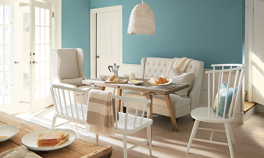
Sea Green
Sea green is an ultimately popular choice of color especially for those who are living near the beach. It’s cool and warm at the same time. It is the perfect color if you want to achieve a minimalistic vibe yet still bring the coolness of the ocean to your own space.
The sea green color sets a nice mood for any room. As it is almost closer to turquoise, it echoes sea waves and cool waters in your senses. You can accentuate your room with furniture and decorations in earthly tones.
This way, you can enjoy heaven and earth right in your small space. Perfect, isn’t it?
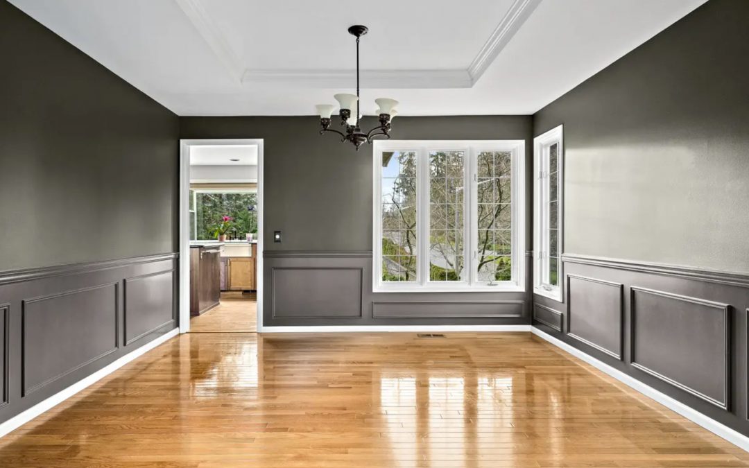
Charcoal Black
If you don’t want to utilize nude and white elements for your room but still want to make a small space look big, you can experiment with charcoal black. This color might be dark but when used wisely, it can make your room feel more intimate rather than stuffy.
For example, you can use charcoal black for your walls but you can use white or creamy paint for the moldings and ceilings. Try to add shiny wooden furniture to accentuate the space. Add some sparkling gold tones for your lampshade or lights perhaps.
Anything that shimmer catches attention and when contrasted with black will definitely look more attractive. Pair your charcoal black room with more sophisticated accents such as white and gray, or even light blues or purple.
The key is with the right combination of elements. In any case, dark charcoal black is an elegant color. As long as you don’t add any red tones to your room, black will give you a grand open space.
Wild Fox Painting
Guest Writer
Wild Fox Painting is focused on providing Trustworthy, Reliable and Respectful interior painting solutions for your home.


Recent Comments